Edland Man
Focus Magazine
![[Card Backs]](emanbk2.gif)
![[Joker]](emanjk2.gif) About
all I can tell you about Edland Man himself is what I found written on
the title card of the deck. All I can tell you about his work I learned
in this deck as well, although I did manage to find one
other photograph of his on the web. However, here is a quick synopsis
of the life of the artist hiself.
About
all I can tell you about Edland Man himself is what I found written on
the title card of the deck. All I can tell you about his work I learned
in this deck as well, although I did manage to find one
other photograph of his on the web. However, here is a quick synopsis
of the life of the artist hiself.
Born in Utrech in 1957, Edland Man attended the Minerva Academy of Art
in Groningen. He specialized in photography, painting and fashion illustration,
and for his final year went to Milan, where various Italian fashion magazines
commissioned illustrations from him. After graduating in 1986, Man returned
to Milan to establish himself as an illustrator. Within a few years, Man
was doing photography assignments, a genre on which he concentrates more
each year. Currently, in addition to fashion illustration and photography,
his work involves television and video advertisements. He now also lectures
at the Rietveld Academy of Art in Amsterdam.
This particular deck came about as the result of a fashion photography
feature published in the Italian magazine Moda. The feature was
conceived by art director Marina Fausti, and involved Man creating a number
of cards for the project. Man liked the aesthetic effect enough to complete
the pack of 53 cards, including the Joker. In this deck, you can see a
number of stylistic themes common to many of the cards, and I was pleased
to see stylistic similarities between these cards and the other photograph
I found (see above). Of course, it's not possible to truly grasp these
subtleties with the six cards presented here, and it's difficult enough
to see the beauty of the cards themselves in these reduced scans. But unless
you happen to find yourself at the Guggenheim
Museum in New York City (where I bought this deck), you may find it
hard to see the whole thing for yourself.
All images © Edland Man 1994, and text © Uitgeverij Focus
1994, displayed here for commentary, analysis and appreciation only.
|
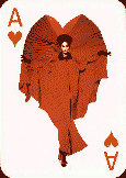
Ace of Hearts

|
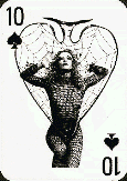
Ten of Spades

|
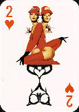
Two of Hearts

|
|
King of Clubs

|
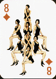
Eight of Diamonds

|
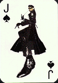
Jack of Spades

|
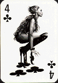
First and most obviously, note that each of the compositions mirrors
the card itself. The image on each card not only mirrors the shape of the
suit symbol, but often mirrors the value itself as well. Note how the dress
on the Ace of Hearts is heart shaped itself, how the eight photographs
of the model are arrayed in a diamond on the Eight of Diamonds, and even
how the model in the Four of Clubs is herself shaped like a four. Even
the Jack of Spades approximates the shape of a spade, even as he suggests
the form of a J. Many if not all of the photographs can be seen as analogs
of the cards they occupy, even down to the clown-painted Joker.
The red suited cards are all in color, and the black suited cards are
all in black and white (the face of the Jack being a small exception).
The hearts and diamonds are also much tamer, being much more traditional
fashion photography. The spades and clubs, on the other hand, are much
more overtly sexual, with many partly-clothed and completely unclothed
models, alone and in pairs. Most of the models, as in fashion photography
itself, are women. As you can see in the Ten and the Four (and to a lesser
extent in the Two), Man is quite aware of the strong sexual nature of fashion
photography. Throughout the deck, that tension is explored, along with
the sexual roles of men and women in fashion imagery.
There are a number of lesser motifs as well. Note in the Four and the
Jack, the elongated or exaggerated boots. These boots, and the often exaggerated
legs leading up to them, show up in several places on the deck, and are
created both by the use of pure perspective, as in the Jack, and by graphic
and optical effects like the Four. And see in the Two and the Jack the
characteristic hand gesture, also seen in the photograph referenced above.
In many places, the fingers are exaggerated like the boots. And there are
many parallels in the cards not shown as well, in pose, composition, photographic
effects, and even hair, which often parallels the characteristic hand gesture.
In short, this deck is an engaging photographic essay by a master photographer
who knows his subject matter acutely well. It's a rewarding work of art
I'm proud to have a copy of, and I'm entranced by the levels of parallelism
in the images and in what they convey.
Return to cards page
Send me mail.
![[Card Backs]](emanbk2.gif)
![[Joker]](emanjk2.gif) About
all I can tell you about Edland Man himself is what I found written on
the title card of the deck. All I can tell you about his work I learned
in this deck as well, although I did manage to find one
other photograph of his on the web. However, here is a quick synopsis
of the life of the artist hiself.
About
all I can tell you about Edland Man himself is what I found written on
the title card of the deck. All I can tell you about his work I learned
in this deck as well, although I did manage to find one
other photograph of his on the web. However, here is a quick synopsis
of the life of the artist hiself.